When we got the chance to go to Pixar Animation Studios and talk to the filmmakers behind Incredibles 2, we never could have expected to learn as much as we did about the immense amount of work it takes to build the massive world of a Pixar film. Throughout the filmmaking process on these films, teams large and small must work together as cohesive units to inform and inspire one another, and ultimately to create the final, massive world that we see onscreen. Incredibles 2 is no different. In fact, the team behind Incredibles 2 actually had less time than average to pull off some really impressive feats!
We were ecstatic to take a deeper dive into a couple of the locations we will be traveling to in Incredibles 2, with some help from the people who created them. Take a look:
The Parr Family’s New Home
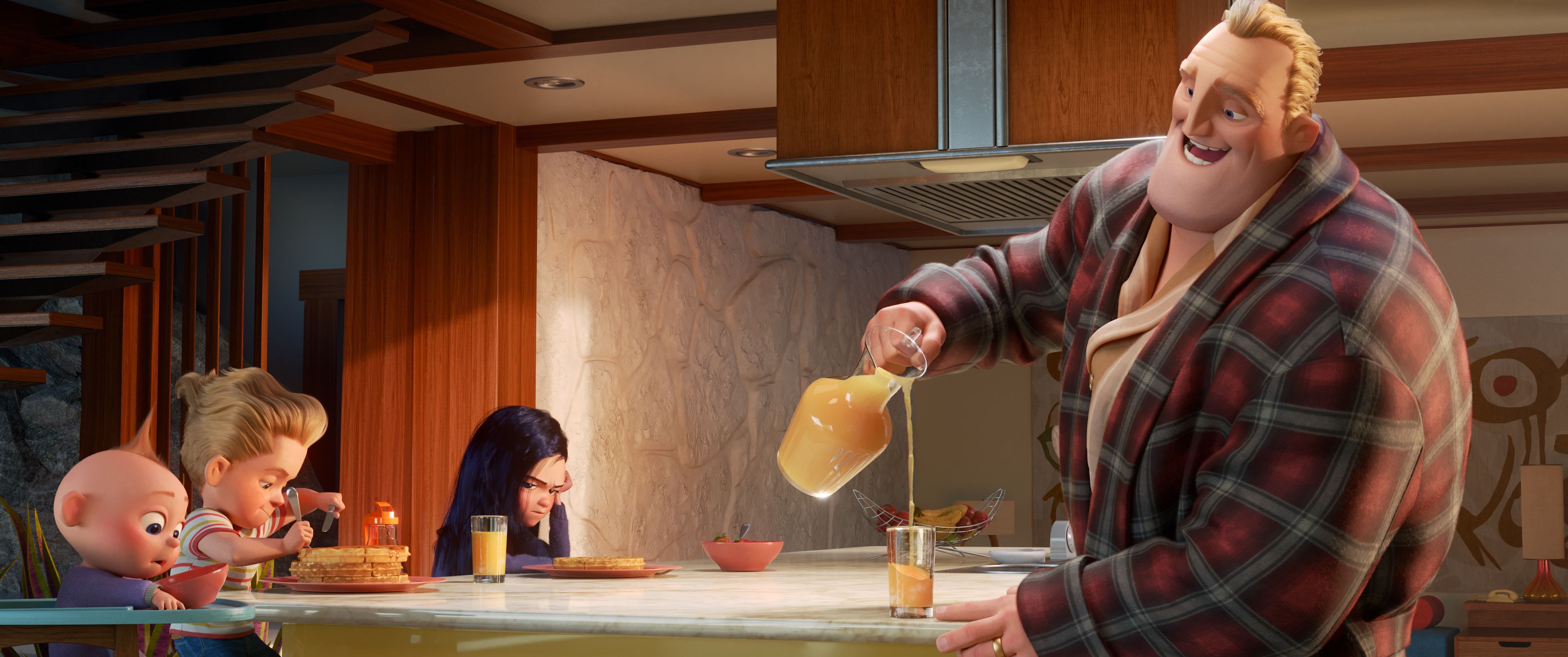
At the end of The Incredibles, the Parr family’s home gets destroyed, meaning that in this film, it’s time for some new digs! While the family spends some time crammed together in a motel at the start of the film, they eventually move into an incredible home influenced by the mid-century modern styles we saw in the first film.
“It’s easy to find colors and textures, palettes that are specific to mid-century design, so we just picked up on those and used them throughout the film,” said Bryn Imagire, the film’s Art Director.
Check out this piece of concept art for a glimpse at the home:
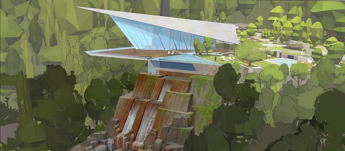
We want to live there! This home was actually the second home that the production design team built for the film. The initial home that was created was around 2,300 square feet. The new home? 20,000 square feet!
“We had actually pitched the idea of a larger house earlier and the story necessitated that they live in a more comfortable home,” said Production Designer Ralph Eggleston.
What happened was, at a certain point while Brad [Bird] was writing, he had to consolidate a number of sequences into one … then I pitched the idea of the larger house again and something clicked. We had just finished the other house, we were so ahead of the game. [But] it was worth it.
In addition to finding inspiration through the works of architects like Frank Lloyd Wright and photographers like Ezra Stoller, the team visited Palm Springs, home to many mid-century modern buildings that appear to be frozen in time, for inspiration. Do you get any Palm Springs vibes from the concept art below? We certainly do!
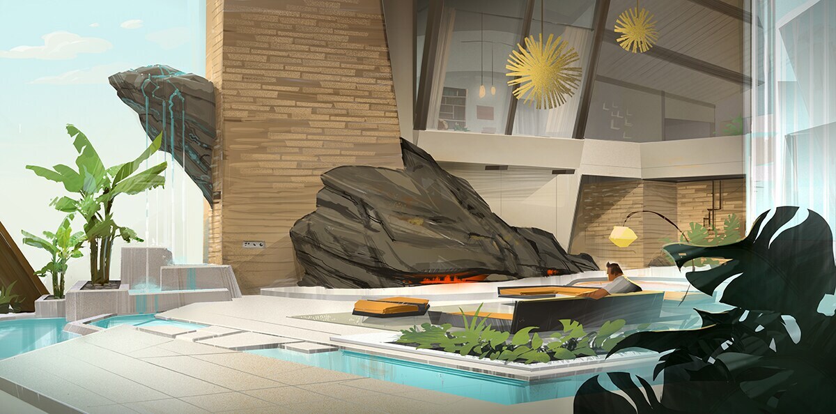
“A lot of the elements ... were lifted from the first house that we built, and we had to very carefully rearrange it,” said Eggleston.
When it comes to the design of the house, Imagire told us:
We have to figure out, what are the iconic textures of this time period? There’s a lot of grass cloth, a lot of mixture of material … A lot of very sleek, very simple shapes. A lot of the fabrics are really nubbly and textured-y. It was cool to try to bring that into the film. It’s a subtle thing, but it’s a good way of bringing in a sense of style.
“It was fun to think like an architect and have fun that way, without having to worry about code or safety,” laughed Eggleston. “We got to pretend we knew what we were doing. It had to look like it worked, it didn’t need to work.”
The City of Municiberg
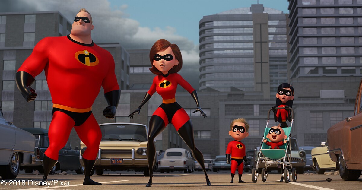
For the city of Municiberg, the team focused more on what Eggleston refers to as the “mid-century mundane.”
“It’s not the coolest buildings, it’s the stuff in between the coolest buildings of mid-century.” He added, “It’s actually easy to find really cool-looking mid-century architecture. It’s harder to find stuff that’s less identifiable.”
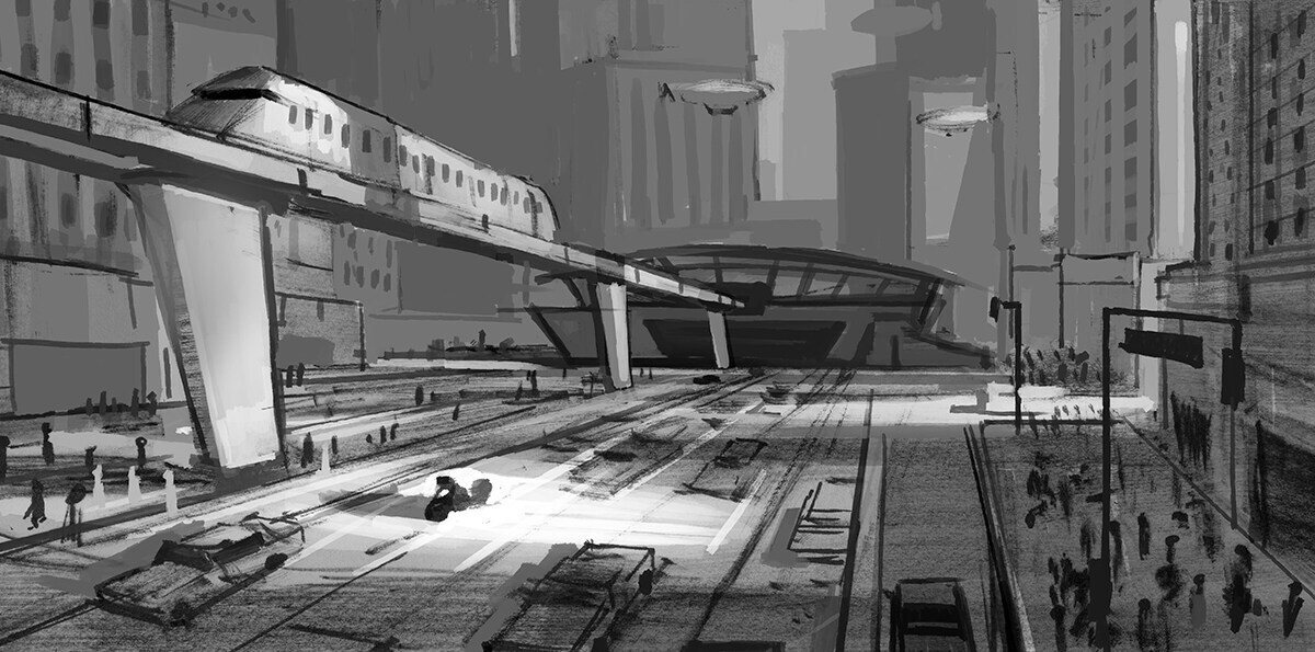
“From a sets perspective, a city is a terrifying thing,” said Sets Supervisor Nathan Fariss. “It is an overwhelming thing to consider, because we have to build all that stuff.”
To build Municiberg this time around, the team dug up original artwork from the first film, and “built the city working from the original film backwards,” said Eggleston. They even built an animated 3D model of the entire city of Municiberg to work with, coordinating over time to add in details like cars, parking meters, signs on the sides of buildings, air conditioning units, and more of your usual city stuff.
The Sets Department, as supervised by Fariss, has a lot to think about during the building of these worlds: “We make a lot of stuff, we make all the props, we make the architecture, both inside and out, we make all the vehicles, we make the all the vegetation … and we do skies and set extensions as well.”
Just another day at the office! This is also the team that does things we take for granted: making marble shiny, adding texture to fabrics and objects, and even making lines less straight. However, Fariss noted: “In the world of The Incredibles, this is a very subtle thing, because mid-century design is all about straight lines, broad shapes, it’s not about wiggly things and a lot of crunchy detail.”
We can’t wait to see this city in action!
And what was it like to work with director Brad Bird creating these worlds and more?
“The cool thing about working with Brad is that he always wants it to be the best and most awesome,” Imagire said.
“The best and most everything,” added Eggleston.
We can’t wait to see it all come to life when Incredibles 2 hits theaters on June 15!
 Disney.com